http://www.paulvangent.com/2016/03/30/analyzing-a-discrete-heart-rate-signal-using-python-part-3/


Analyzing a Discrete Heart Rate Signal Using Python – Part 3


Analyzing a Discrete Heart Rate Signal Using Python – Part 3

HB

This the third part in a four part series about how to use Python for heart rate analysis. In this part you will learn about how to improve peak detection using a dynamic threshold, signal filtering, and outlier detection.


Important: The code in this tutorial is licensed under the GNU 3.0 open source license and you are free to modify and redistribute the code, given that you give others you share the code with the same right, and cite my name (use citation format below). You are not free to redistribute or modify the tutorial itself in any way. By reading on you agree to these terms. If you disagree, please navigate away from this page.

Citation format
van Gent, P. (2016). Analyzing a Discrete Heart Rate Signal Using Python. A tech blog about fun things with Python and embedded electronics. Retrieved from: http://www.paulvangent.com/2016/03/30/analyzing-a-discrete-heart-rate-signal-using-python-part-3

IE users: I’ve gotten several reports that sometimes the code blocks don’t display correctly or at all on Internet Explorer. Please refresh the page and they should display fine.


The following tutorial assumes basic knowledge of the Python programming language, FIR-filters andfast fourier transform methods. The tutorial should be suitable for those with most levels of Python skill. It is divided into separate parts so that you can easily skip over those parts you understand anyway. The data was collected with a simple data logger based on an ATTiny45, as described in another post.

All data in this tutorial is recorded with the Pulse Sensor, which I’ve found to be a great little device to easily log heart rate data from the fingertips. I have used it / am using it for research with video games, driving simulators and on-road experiments with car drivers.


Some Theory and Background
So far we’ve been over how to analyze a heart rate signal and extract the most widely used time domain and frequency domain measures from it. However, the signal we used was ideal. Now consider this signal:

Pt3_NoisySignal

A challenge! This is the other extreme of the signal qualities you will run into. To be honest I cheated and generated this signal by measuring while I was attaching the sensor to my finger (between 0 and about 4000). Immediately after this the blood vessels in the finger need to adapt to being compressed by the sensor (at about 4000-5000), after which the signal becomes stable. At about 7500, 9000 and 12000 I forcefully moved the sensor over my finger to create extra noise. I was surprised at how well the sensor suppresses noise by itself, so well done guys at pulsesensor.com.

Although this signal is manually ‘destroyed’ at points, in practice it can will happen that parts of your data contain noise or artefacts. The sensor might move which creates noise, it might not be correctly attached or become detached during the measurement, the participant might sneeze, move, or any other noise inducing factor might interfere.

We will see how to deal with this in a few stages:

  • Getting started, evaluate the result of passing this signal to our algorithm from part two;
  • Careful: Sampling Frequency;
  • Filter the signal to remove unwanted frequencies (noise);
  • Improving detection accuracy with a dynamic threshold;
  • Detecting incorrectly detected / missed peaks;
  • Removing errors and reconstructing the R-R signal to be error-free.

Getting Started
First let’s see how our algorithm from part 2 handles this signal. Download the dataset here.

1
2
3
  (...) line 37in detect_peaks
    maximum = max(window)
ValueErrormax() arg is an empty sequence

Great, it doesn’t. What is happening?

Some may have noticed it before, our detect_peaks() function will break in one eventuality: when the heart rate signal goes from being smaller than the moving average, to becoming equal to it without moving above it for at least two data points in a row. The most likely case of this happening is if the signal drops to zero for a period of time. The function will then skip to the else statement and try to detect peaks in the ROI, but no ROI has been marked because the signal never rose above the moving average, so max(window) throws the error because an empty list has no maximum. This happensbecause I’m an idiot because in the loop the situation where both signals are of equal height is not accounted for, which happens to happen early on in the signal, where I’m attaching the sensor to my finger:

Pt3_DropToZero

If you didn’t notice this in the code before, don’t worry, neither did I at first. Now to update thedetect_peaks() function:

1
2
3
4
5
6
7
8
9
10
11
12
13
14
15
16
17
18
19
def detect_peaks(dataset):
    window = []
    peaklist = []
    listpos = 0 
    for datapoint in dataset.hart:
        rollingmean = dataset.hart_rollingmean[listpos]
        if (datapoint <= rollingmean) and (len(window) <= 1)#Here is the update in (datapoint <= rollingmean)
            listpos += 1
        elif (datapoint > rollingmean):
            window.append(datapoint)
            listpos += 1
        else:
            maximum = max(window)
            beatposition = listpos - len(window) + (window.index(max(window)))
            peaklist.append(beatposition)
            window = []
            listpos += 1
    measures['peaklist'] = peaklist
    measures['ybeat'] = [dataset.hart[x] for x in peaklist]

For now also comment out line 19, we will get to this later on.

1
2
3
4
5
6
def rolmean(datasethrwfs):
    mov_avg = pd.rolling_mean(dataset.hartwindow=(hrw*fs))
    avg_hr = (np.mean(dataset.hart)) 
    mov_avg = [avg_hr if math.isnan(x) else x for x in mov_avg]
    #mov_avg = [x*1.2 for x in mov_avg]
    dataset['hart_rollingmean'] = mov_avg

And plot again, this time with peak detection:

The module is not throwing errors anymore and is detecting peaks, but it is hardly the result we’re looking for. Let’s start by looking at noise reduction to see if we can improve the signal.


Sampling Frequency
Before getting to signal filtering let’s determine the sample rate of our file. The file from the previous two parts was 100Hz, what about this one? In practice the actual recording frequency may vary with different devices or systems. It can also be (slightly) different than what the devices are rated for. The accuracy of all the calculated measures is dependent on accurately knowing the sample rate, so this is important to check. Even a difference of 100Hz and 101Hz can lead to significantly different results if you combine data from various sources. I usually log either ‘world time’ or ‘time since start of recording’ with every data line for the purpose of calculating and verifying sample rate afterwards.

With this it is straightforward to calculate the sampling rate:

1
2
3
4
5
6
7
8
9
10
#Simple way to get sample rate
sampletimer = [x for x in dataset.timer] #dataset.timer is a ms counter with start of recording at '0'
measures['fs'] = ((len(sampletimer) / sampletimer[-1])*1000) #Divide total length of dataset by last timer entry. This is in ms, so multiply by 1000 to get Hz value
#If your timer is a date time string, convert to UNIX timestamp to more easily calculate with, use something like this:
unix_time = []
for x in dataset.datetime:
    dt = datetime.datetime.strptime(Datum"%Y-%m-%d %H:%M:%S.%f")
    unix_time.append(time.mktime(dt.timetuple()) + (dt.microsecond / 1000000.0))
measures['fs'] = (len(unix_time) / (unix_time[-1] - unix_time[0]))

The sample rate of the file provided here is actually 117Hz! The measures can now be calculated automatically using the determined sample rate.

Note that this is not the whole story, apart from sample rate you should also check your data for sampling spread; are all samples spaced evenly apart, e.g. are there no ‘gaps’ or ‘skips’ in the datastream? If your data contains gaps and skips, provided they are only a few samples long at maximum, consider interpolating the missing values before processing. If your sampling rate varies much over time you’re in trouble, use a different datalogging device.

Now that we know the sampling frequency more accurately, we can move on to signal filtering.


Signal Filtering
The first thing you should do when encountering artefacts or noisy signals (some would argue: always) is try to filter your signal. Why? Because in any real-life measuring situation your signal, whatever it may be, will consist of a signal part and an error part. This is because the perfect sensor does not exist, so it will always pick up interference from sources other than the one you are trying to measure. An example of common interference is power line noise. The AC power from the wall contacts in most countries has a frequency of 50Hz (some, such as the U.S., use 60Hz). This noise is present in many raw ECG-measurements as well.

An often used filter to reduce noise is the Butterworth Filter, which is characterized by a very even response to frequencies within the specified range. It acts as a ‘frequency gate’; suppressing frequencies beyond the specified cutoff range, more so as the frequencies move further away from it. This cutoff point is not a hard line. What I mean is that if you set the cutoff frequency at for example 5Hz, a signal of 5.1Hz will still be let through the filter, it will just be slightly reduced in amplitude (or ‘volume’, if that makes more sense). A signal of 10Hz on the other hand will only get through very weakly, if at all. This is also dependent on the filter order, as is illustrated nicely here.
Still difficult to understand? Think about it like this: you’re at a party and two people are talking to you simultaneously, leading to a situation where you cannot understand either of them. Now place a filter between you and the two others. The filter will reduce the speaking volume of person 1 without altering the volume of person 2. Now you can understand person 2 just fine. This is what the filter does except with frequencies.

Anyway, let’s get to coding and see if the signal can benefit from filtering. First download and open the dataset if you have not done it yet, define the filter using scipy.signal, filter and finally plot the signal. Assuming you’re working with the code from the previous part, define the filter and plot as such:

1
2
3
4
5
6
7
8
9
10
11
12
13
14
15
16
17
18
19
20
21
22
23
24
25
26
27
28
from scipy.signal import butterlfilter #Import the extra module required
#Define the filter
def butter_lowpass(cutofffsorder=5):
    nyq = 0.5 * fs #Nyquist frequeny is half the sampling frequency
    normal_cutoff = cutoff / nyq 
    ba = butter(ordernormal_cutoffbtype='low'analog=False)
    return ba
    
def butter_lowpass_filter(datacutofffsorder):
    ba = butter_lowpass(cutofffsorder=order)
    y = lfilter(badata)
    return y
dataset = get_data('data2.csv')
dataset = dataset[6000:12000].reset_index(drop=True) #For visibility take a subselection of the entire signal from samples 6000 - 12000 (00:01:00 - 00:02:00)
filtered = butter_lowpass_filter(dataset.hart2.5100.05)#filter the signal with a cutoff at 2.5Hz and a 5th order Butterworth filter
#Plot it
plt.subplot(211)
plt.plot(dataset.hartcolor='Blue'alpha=0.5label='Original Signal')
plt.legend(loc=4)
plt.subplot(212)
plt.plot(filteredcolor='Red'label='Filtered Signal')
plt.ylim(200,800) #limit filtered signal to have same y-axis as original (filter response starts at 0 so otherwise the plot will be scaled)
plt.legend(loc=4)
plt.show()

Now there doesn’t seem to be much improvement in this signal. If you look closely the lines are a little smoother, but there wasn’t a lot of high-amplitude, high-frequency noise there to begin with. It could even be argued that filtering slightly worsens the parts with the lower frequency noise, because there it suppresses the R-peaks a little as well. This is a good example of why you should always plot your signal when you decide to filter it. Filtering the signal changes it, and it is up to you to decide whether this change is for the better.

An example of where a Butterworth Filter was very useful, is this noisy signal I worked with in another project:

Pt3_ExFiltering

No question this improved the signal enough to process it further.


Improving Detection Accuracy With a Dynamic Threshold
The first and maybe most obvious way to reduce the incorrect labeling of the secondary peaks is to raise the moving average we use as a threshold. But raise to what level? This will be different for many different signals. We need measures to help determine which threshold level is probably the most accurate.

A few simple measures can help, we can:

  • Look at signal length and count how many peaks there are vs how many we would expect;
  • Determine and use the standard deviation of RR intervals (let’s call it RRSD).

The amount of detected peaks holds valuable information but only works to reject obvious incorrect thresholds. Depending on your application (most of mine are with people sitting still), we can reject unlikely bpm values. For example I reject thresholds resulting in average bpm of <30bpm and >130bpm. In other situations (physical excercise) the threshold can be different.

The RRSD tells us something about how spread out the differences between all RR-intervals are. Generally if there is not too much noise, the detection that has both the lowest RRSD that is not zeroand also a believable BPM value will be the best fit. RRSD must not be zero because that means there is no heart rate variability, which is a strong indication of mistakes in the detection of R-peaks.

This simple approach works because missing a beat will lead to an RR interval that is about twice as big as the average RR interval, while incorrectly labeling a beat will lead to an RR interval that is at mostabout half as big as the average RR interval, but generally smaller. Both situations lead to anincreased RRSD. In essence we exploit the fact that the heart rate signal contains a fairly stable, recurring pattern.

To illustrate let’s plot four peak detection rounds in a subselection of the dataset, with the moving average raised by 0%, 10%, 25% and 35% (top to bottom):

In the second-to-last plot all R-peaks are detected correctly and nothing has been marked as an R-peak incorrectly. Note that, although the BPM on its own could be valid for all four plots (none of them is an absolute mess), the RRSD strongly points to the plot which is most correct. I say ‘most correct’ because there are situations where some errors will remain no matter how you position the threshold, more on this later. Also note how the missing of a single peak in the last plot already causes the RRSD to increase quite a bit compared to the third one.

Now how to implement this? We cannot simply run 10.000 variations, each with a slightly more raised moving average. Apart from that this would cost us severely in overall performance of the algorithm, it would also be very redundant because many iterations would yield the same correct result (and many others the same incorrect result!). A possible solution is to check with intervals, and afterwards evaluate the most likely RRSD and BPM pair, like this:

1
2
3
4
5
6
7
8
9
10
11
12
13
14
15
16
17
18
19
20
21
22
23
24
25
26
27
28
29
30
31
32
33
34
35
36
37
38
39
def detect_peaks(datasetma_percfs)#Change the function to accept a moving average percentage 'ma_perc' argument
    rolmean = [(x+((x/100)*ma_perc)) for x in dataset.hart_rollingmean] #Raise moving average with passed ma_perc
    window = []
    peaklist = []
    listpos = 0 
    for datapoint in dataset.hart:
        rollingmean = rolmean[listpos]
        if (datapoint <= rollingmean) and (len(window) <= 1)#Here is the update in (datapoint <= rollingmean)
            listpos += 1
        elif (datapoint > rollingmean):
            window.append(datapoint)
            listpos += 1
        else:
            maximum = max(window)
            beatposition = listpos - len(window) + (window.index(max(window)))
            peaklist.append(beatposition)
            window = []
            listpos += 1
    measures['peaklist'] = peaklist
    measures['ybeat'] = [dataset.hart[x] for x in peaklist]
    measures['rolmean'] = rolmean
    calc_RR(datasetfs)
    measures['rrsd'] = np.std(measures['RR_list'])
def fit_peaks(datasetfs):
    ma_perc_list = [51015202530405060708090100110120150200300] #List with moving average raise percentages, make as detailed as you like but keep an eye on speed
    rrsd = []
    valid_ma = []
    for x in ma_perc_list#Detect peaks with all percentages, append results to list 'rrsd'
        detect_peaks(datasetxfs)
        bpm = ((len(measures['peaklist'])/(len(dataset.hart)/fs))*60)
        rrsd.append([measures['rrsd']bpmx])
        
    for x,y,z in rrsd#Test list entries and select valid measures
        if ((x > 1) and ((y > 30) and (y < 130))):
            valid_ma.append([xz])
            
    measures['best'] = min(valid_makey = lambda tt[0])[1] #Save the ma_perc for plotting purposes later on (not needed)
    detect_peaks(datasetmin(valid_makey = lambda tt[0])[1]fs) #Detect peaks with 'ma_perc' that goes with lowest rrsd

Now run and plot on the dataset (timed the entire algorithm so far including loading and preprocessing at about 151ms, single core performance on an i7-4790, so it’s still still pretty quick. Multithreading will speed this up a lot):

PT3_DynPlot

That is already a lot better. It’s not dropping any correct R-peaks, but there are still a few incorrect detections remaining, and there is also the part from 0 to about 5000 which contains little to no heart rate signal. We will come back to this noisy segment and see how to detect and exclude segments of noise in part 4.

For now let’s take out the noisy part at the beginning and see how we can detect and reject outliers.


Finding Incorrectly Detected Peaks
The last thing to look at is how to detect and reject abnormal peak positions. One way to do this is to make use of the fact that the heart rate changes gradually rather than abruptly. Your bpm for example will not skip from 60bpm to 120bpm in a single beat or vice versa, so let’s make use of that.

Again this means returning to RR-intervals. Remember that if a peak is skipped in the detection, or two peaks are marked in stead of one, the resulting RR-interval will be a lot larger or smaller than the average interval. We can set a threshold and mark intervals that exceed it, similar to how we detected the peaks. For the data I collect this is enough.

There is, however, one potential complication. If you analyze a very long signal at once, wherein the heart rate changes a lot over time, this can lead to incorrect rejections. Imagine a signal with a gradually increasing heart rate, starting from 60 bpm and ending at 180bpm. This means a steady trend of decreasing RR-intervals, which is indicative of the speeding up of the heart rate rather than mistakes in the detection of R-peaks. By using just thresholds based on the mean RR-interval, this will result in a rejection of the first and last portion of the signal. If this happens in your data you could detrend RR_list first. Using scipy.signal, this is easy:

1
2
3
4
from scipy import signal
RR_list = measures['RR_list'] #First retrieve list from dictionary
RR_list_detrended = signal.detrend(RR_listtype='linear')

However, if your signal contains a period of large increases followed by similarly large decreases in heart rate, you will need to employ other methods. The solution is beyond the scope of this tutorial series, but if you have this problem you may want to use a high pass filter with a very low cutoff frequency. Another way could be to split the signal in to smaller portions (so that the increase and decrease trends are separated), detrend linearly and average the measures. If the smaller portions are not of equal length, be sure to weight the measures before averaging.
Naturally, do not calculate any measures with the detrended RR-signal, only use it for the detection of errors in peak marking.

Back to outlier rejection. For the thresholds, in practice I’ve found a threshold level of the mean of RR-differences with a band of 250-300ms on both ends works well. Using the previous code and limiting the dataset to [5000:15000] (to exclude the noisy beginning for now), implement like so:

1
2
3
4
5
6
7
8
9
10
11
12
13
14
15
16
17
18
19
20
21
22
23
24
25
26
27
28
29
30
31
32
33
34
35
36
37
RR_list = measures['RR_list'] #Get measures
peaklist = measures['peaklist']
ybeat = measures['ybeat']
upper_threshold = (np.mean(RR_list) + 300) #Set thresholds
lower_threshold = (np.mean(RR_list) - 300)
#detect outliers
cnt = 0
removed_beats = []
removed_beats_y = []
RR2 = []
while cnt < len(RR_list):
    if (RR_list[cnt] < upper_threshold) and (RR_list[cnt] > lower_threshold):
        RR2.append(RR_list[cnt])
        cnt += 1
    else:   
        removed_beats.append(peaklist[cnt])
        removed_beats_y.append(ybeat[cnt])
        cnt += 1
measures['RR_list_cor'] = RR2 #Append corrected RR-list to dictionary
plt.subplot(211)
plt.title('Marked Uncertain Peaks')
plt.plot(dataset.hartcolor='blue'alpha=0.6label='heart rate signal')
plt.plot(measures['rolmean']color='green')
plt.scatter(measures['peaklist']measures['ybeat']color='green')
plt.scatter(removed_beatsremoved_beats_ycolor='red'label='Detection uncertain')
plt.legend(framealpha=0.6loc=4)
plt.subplot(212)
plt.title("RR-intervals with thresholds")
plt.plot(RR_list)
plt.axhline(y=upper_thresholdcolor='red')
plt.axhline(y=lower_thresholdcolor='red')
plt.show()

Resulting in:

Pt3_RR_PeakRejection4

It seems we got all the little buggers. The result is a plot with all correctly detected R-peaks marked green. The incorrect ones are marked red. The generated list measures[‘RR_list_cor’] has the RR-list without those belonging to incorrect peaks in it.

In part 4 we will look into how to mark and exclude noise segments and a few other optimizations.


Rounding up
Now tidy up all code, and also to update some functions to accept new variables and insert the peak rejection function.

1
2
3
4
5
6
7
8
9
10
11
12
13
14
15
16
17
18
19
20
21
22
23
24
25
26
27
28
29
30
31
32
33
34
35
36
37
38
39
40
41
42
43
44
45
46
47
48
49
50
51
52
53
54
55
56
57
58
59
60
61
62
63
64
65
66
67
68
69
70
71
72
73
74
75
76
77
78
79
80
81
82
83
84
85
86
87
88
89
90
91
92
93
94
95
96
97
98
99
100
101
102
103
104
105
106
107
108
109
110
111
112
113
114
115
116
117
118
119
120
121
122
123
124
125
126
127
128
129
130
131
132
133
134
135
136
137
138
139
140
141
142
143
144
145
146
147
148
149
150
151
152
153
154
155
156
157
158
159
160
161
162
163
164
165
166
167
168
169
170
171
172
173
174
175
import pandas as pd
import matplotlib.pyplot as plt
import numpy as np
import math
from scipy.interpolate import interp1d
from scipy.signal import butterlfilterdetrend
measures = {}
#Preprocessing
def get_data(filename):
    dataset = pd.read_csv(filename)
    return dataset
def get_samplerate(dataset):
    sampletimer = [x for x in dataset.datetime]
    measures['fs'] = ((len(sampletimer) / sampletimer[-1])*1000)
def rolmean(datasethrwfs):
    mov_avg = pd.rolling_mean(dataset.hartwindow=(hrw*fs)center=False)
    avg_hr = (np.mean(dataset.hart)) 
    mov_avg = [avg_hr if math.isnan(x) else x for x in mov_avg]
    dataset['hart_rollingmean'] = mov_avg
def butter_lowpass(cutofffsorder=5):
    nyq = 0.5 * fs
    normal_cutoff = cutoff / nyq
    ba = butter(ordernormal_cutoffbtype='low'analog=False)
    return ba
def butter_lowpass_filter(datacutofffsorder):
    ba = butter_lowpass(cutofffsorder=order)
    y = lfilter(badata)
    return y    
def filtersignal(datacutofffsorder):
    hart = [math.pow(x3) for x in dataset.hart]
    hartfiltered = butter_lowpass_filter(hartcutofffsorder)
    dataset['hart'] = hartfiltered
#Peak detection
def detect_peaks(datasetma_percfs):
    rolmean = [(x+((x/100)*ma_perc)) for x in dataset.hart_rollingmean]
    window = []
    peaklist = []
    listpos = 0 
    for datapoint in dataset.hart:
        rollingmean = rolmean[listpos]
        if (datapoint <= rollingmean) and (len(window) <= 1)#Here is the update in (datapoint <= rollingmean)
            listpos += 1
        elif (datapoint > rollingmean):
            window.append(datapoint)
            listpos += 1
        else:
            maximum = max(window)
            beatposition = listpos - len(window) + (window.index(max(window)))
            peaklist.append(beatposition)
            window = []
            listpos += 1
    measures['peaklist'] = peaklist
    measures['ybeat'] = [dataset.hart[x] for x in peaklist]
    measures['rolmean'] = rolmean
    calc_RR(datasetfs)
    measures['rrsd'] = np.std(measures['RR_list'])
def fit_peaks(datasetfs):
    ma_perc_list = [51015202530405060708090100110120150200300] #List with moving average raise percentages, make as detailed as you like but keep an eye on speed
    rrsd = []
    valid_ma = []
    for x in ma_perc_list:
        detect_peaks(datasetxfs)
        bpm = ((len(measures['peaklist'])/(len(dataset.hart)/fs))*60)
        rrsd.append([measures['rrsd']bpmx])
    for x,y,z in rrsd:
        print xyz
        if ((x > 1) and ((y > 30) and (y < 130))):
            valid_ma.append([xz]) 
    measures['best'] = min(valid_makey = lambda tt[0])[1]
    detect_peaks(datasetmin(valid_makey = lambda tt[0])[1]fs)
def check_peaks(dataset):
    RR_list = measures['RR_list']
    peaklist = measures['peaklist']
    ybeat = measures['ybeat']
    upper_threshold = np.mean(RR_list) + 300
    lower_threshold = np.mean(RR_list) - 300
    removed_beats = []
    removed_beats_y = []
    RR_list_cor = []
    peaklist_cor = [peaklist[0]]
    cnt = 0
    while cnt < len(RR_list):
        if (RR_list[cnt] < upper_threshold) and (RR_list[cnt] > lower_threshold):
            RR_list_cor.append(RR_list[cnt])
            peaklist_cor.append(peaklist[cnt+1]) 
            cnt += 1
        else:    
            removed_beats.append(peaklist[cnt+1])
            removed_beats_y.append(ybeat[cnt+1])
            cnt += 1
    measures['RR_list_cor'] = RR_list_cor
    measures['peaklist_cor'] = peaklist_cor
#Calculating all measures
def calc_RR(datasetfs):
    peaklist = measures['peaklist']
    RR_list = []
    cnt = 0
    while (cnt < (len(peaklist)-1)):
        RR_interval = (peaklist[cnt+1] - peaklist[cnt])
        ms_dist = ((RR_interval / fs) * 1000.0)
        RR_list.append(ms_dist)
        cnt += 1
    RR_diff = []
    RR_sqdiff = []
    cnt = 0 
    while (cnt < (len(RR_list)-1))
        RR_diff.append(abs(RR_list[cnt] - RR_list[cnt+1])) 
        RR_sqdiff.append(math.pow(RR_list[cnt] - RR_list[cnt+1]2))
        cnt += 1
    measures['RR_list'] = RR_list
    measures['RR_diff'] = RR_diff
    measures['RR_sqdiff'] = RR_sqdiff
    
def calc_ts_measures(dataset):
    RR_list = measures['RR_list_cor']
    RR_diff = measures['RR_diff']
    RR_sqdiff = measures['RR_sqdiff']
    measures['bpm'] = 60000 / np.mean(RR_list)
    measures['ibi'] = np.mean(RR_list)
    measures['sdnn'] = np.std(RR_list)
    measures['sdsd'] = np.std(RR_diff)
    measures['rmssd'] = np.sqrt(np.mean(RR_sqdiff))
    NN20 = [x for x in RR_diff if (x>20)]
    NN50 = [x for x in RR_diff if (x>50)]
    measures['nn20'] = NN20
    measures['nn50'] = NN50
    measures['pnn20'] = float(len(NN20)) / float(len(RR_diff))
    measures['pnn50'] = float(len(NN50)) / float(len(RR_diff))
def calc_fd_measures(datasetfs):
    peaklist = measures['peaklist_cor']
    RR_list = measures['RR_list_cor']
    RR_x = peaklist[1:]
    RR_y = RR_list
    RR_x_new = np.linspace(RR_x[0],RR_x[-1],RR_x[-1])
    f = interp1d(RR_xRR_ykind='cubic')
    n = len(dataset.hart)
    frq = np.fft.fftfreq(len(dataset.hart)d=((1/fs)))
    frq = frq[range(n/2)]
    Y = np.fft.fft(f(RR_x_new))/n
    Y = Y[range(n/2)]
    measures['lf'] = np.trapz(abs(Y[(frq>=0.04) & (frq<=0.15)]))
    measures['hf'] = np.trapz(abs(Y[(frq>=0.16) & (frq<=0.5)]))
#Plotting it
def plotter(dataset):
    peaklist = measures['peaklist']
    ybeat = measures['ybeat']
    plt.title("Best fit: mov_avg %s percent raised" %measures['best'])
    plt.plot(dataset.hartalpha=0.5color='blue'label="heart rate signal")
    plt.plot(measures['rolmean']color ='green'label="moving average")
    plt.scatter(peaklistybeatcolor='red'label="RRSD:%.2f\nBPM:%.2f" %(np.std(measures['RR_list'])measures['bpm']))#, label="average: %.1f BPM" %measures['bpm'])
    plt.legend(loc=4framealpha=0.6) 
    plt.show() 
#Wrapper function
def process(datasethrwfs):
    filtersignal(dataset2.5fs5)
    rolmean(datasethrwfs)
    fit_peaks(datasetfs)
    calc_RR(datasetfs)
    check_peaks(dataset)
    calc_ts_measures(dataset)
    calc_fd_measures(datasetfs)


Posted by uniqueone
,

Independent Component Analysis and its Extensions as Models of Natural Image Statistics

Patrik Hoyer and Aapo Hyvärinen, currently of the Neuroinformatics Group at University of Helsinki.

Get the MATLAB package for estimating ICA, ISA, and TICA bases from image data!


Consider a typical natural image:

\resizebox {10cm}{!}{\includegraphics{typicalimage.ps}}

When we do ICA on image data, that means we are simply trying to find an expansion of the form

\includegraphics {win0.ps}= s1\includegraphics {win1.ps}+ s2\includegraphics {win2.ps}+ ... + sk\includegraphics {wink.ps}

such that for any given window from the image, information about one of the coefficients gives as little information as possible about the others. In other words, they are independent. In the standard ICA model x = As, the coefficients correspond to realizations of the signals s and the basis windows are the column vectors of A.

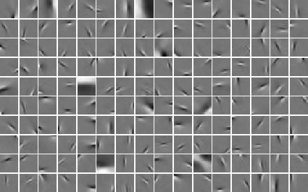
Several investigations by different research groups have indicated that such an objective gives basis windows which are localized both in space and in frequency, resembling the wavelets of signal processing. This is an example of such a basis.

Thus, one may see ICA (and sparse coding, which is closely related to ICA for images) as a way of choosing a basis which is custom-tailored to the data.


Independent Subspace Analysis and Complex Cell Properties

We have also introduced modifications of the basic ICA model that describe further aspects of natural image statistics. The modifications use a linear decomposition as illustrated above, but the components si are not assumed to be all independent.

The first model in this direction is independent subspace analysis, in which the components are divided into groups or subspaces so that components in different subspaces are independent, but components in the same subspace are not. In particular, the distribution of the components in a subspace is assumed to depend only on the norm of the projection on that subspace. Typically, this implies that the components of a subspace tend to be active simultaneously.

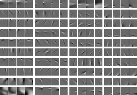
When estimated from natural image data, the model shows emergence of complex cell properties, in particular phase and translation invariance, together with orientation and frequency selectivity. Here are the estimated basis vectors, grouped according to the subspace structure.


Topographic Independent Component Analysis

Furthermore, we have generalized the independent subspace model so that it models more general dependency structures.

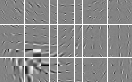
The point is to define a topographic order using the higher-order correlations of the components. Basically, we use correlations of energies, i.e. squares, of the components. Thus we order the basis vectors so that component that are near-by in the topographic representation tend to be active, i.e. non-zero at the same time. This can be considered as a generalization of independent subspaces, so that every neighbourhood corresponds to one subspace. Thus we obtain a linear representation in which the coefficients and the basis vectors have a topographic organization that gives us information on the statistical higher-order structure of the data.

When estimated from natural image data, the model shows simultaneous emergence of topography and complex cell properties. This is because every neighbourhood corresponds to one feature subspace as in independent subspace analysis, i.e. one complex cell.


For details, see the articles available on the publication pages of
Aapo Hyvärinen and Patrik Hoyer

Some data we are currently using can be found here.

Neuroinformatics Group at University of Helsinki


Patrik Hoyer & Aapo Hyvarinen
15 Feb 2000


Posted by uniqueone
,